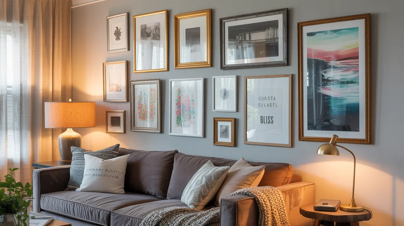
Blank walls are basically just screaming for attention, aren’t they? If you’ve been staring at that empty expanse above your sofa and thinking “something should go there,” I’m about to make your day. Gallery walls are hands-down one of the most impactful ways to transform your living room from “yeah, I live here” to “welcome to my curated space that perfectly represents my soul.”
I’ve spent years helping friends transform their blank walls into personality-filled focal points, and I’ve learned that creating a gallery wall is equal parts art and science. The good news? You don’t need an art degree or an interior designer’s budget to create something spectacular. Let’s dive into some gallery wall ideas that will breathe new life into your living room and showcase who you really are.
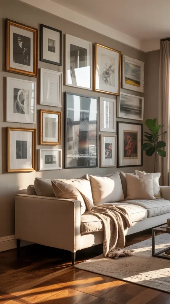
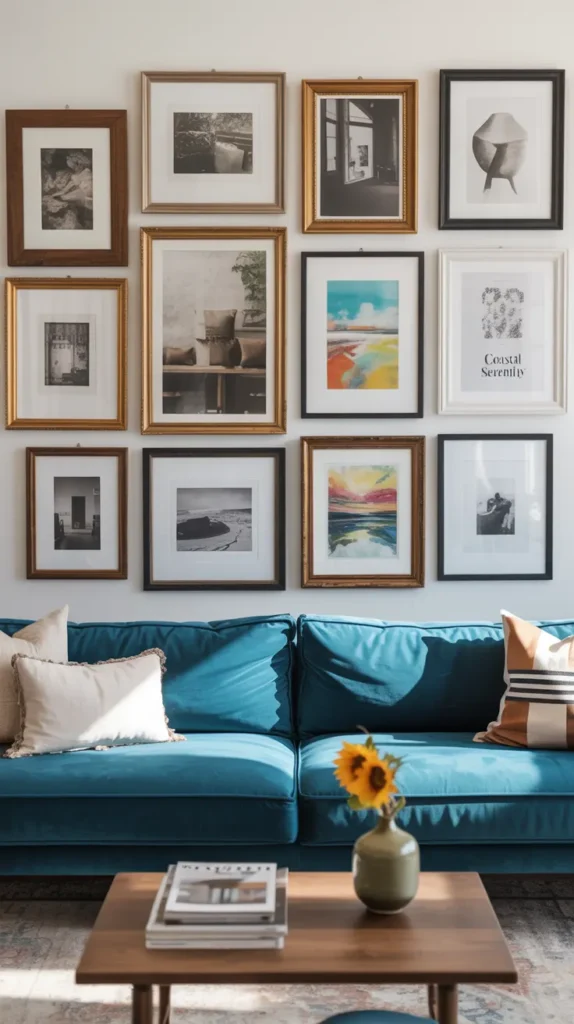
Why Gallery Walls Beat a Single Giant Artwork Every Time
Before we jump into specific ideas, let’s talk about why gallery walls have become such a beloved design feature in modern homes. It’s not just because they look good (though they absolutely do).
Gallery walls offer some serious advantages:
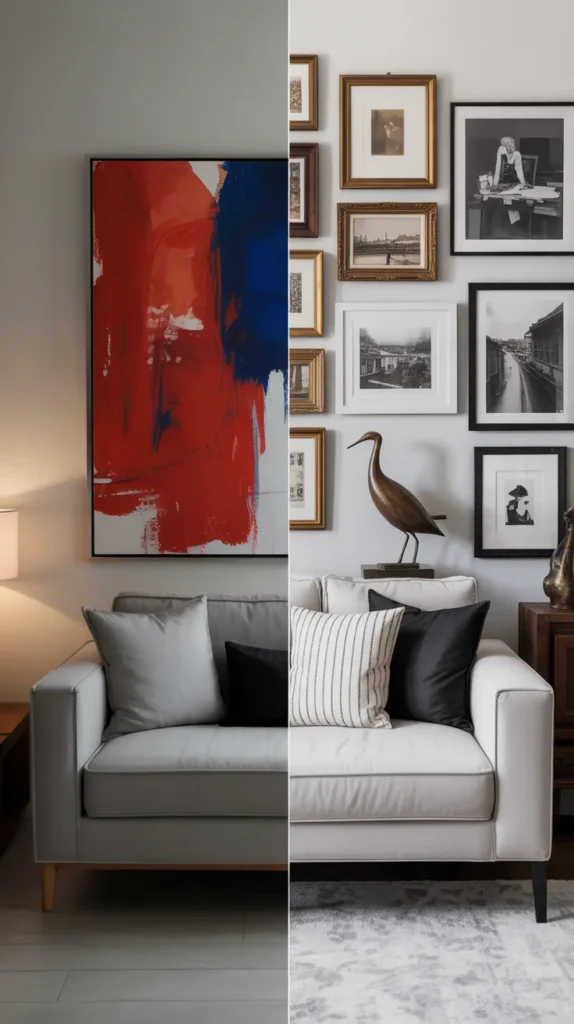
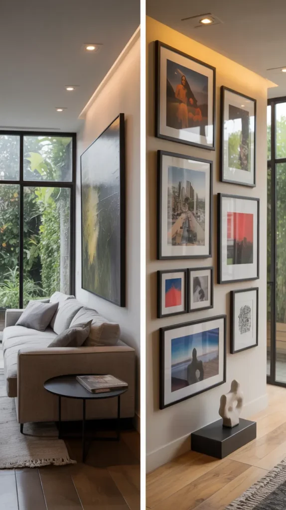
- Personal expression — You can curate a collection that tells your unique story
- Flexibility — Add, remove, or swap pieces as your taste evolves
- Budget-friendly — Build gradually over time instead of investing in one expensive piece
- Space optimization — They make clever use of vertical space, making rooms feel larger
- Conversation starters — Each piece provides an opportunity to share stories with guests
I’ve found that a thoughtfully designed gallery wall does something almost magical to a living room. It instantly creates depth, draws the eye, and makes even the most basic space feel intentional and lived-in. It’s like the difference between a house and a home—one is just a structure, while the other tells a story.
Start With a Theme (But Don’t Be Too Rigid About It)
The most successful gallery walls start with some kind of unifying concept. This doesn’t mean every piece needs to match perfectly (boring!), but having a loose theme helps the collection feel intentional rather than random.
Some theme ideas to consider:
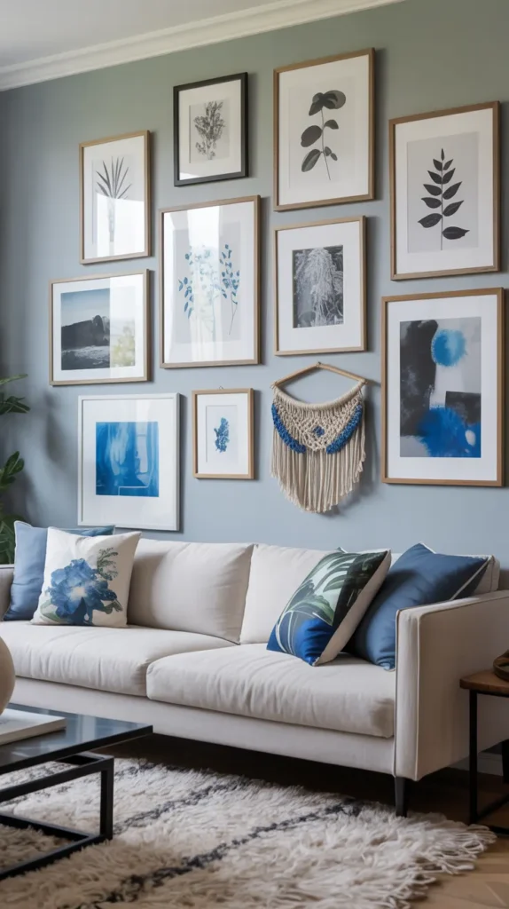
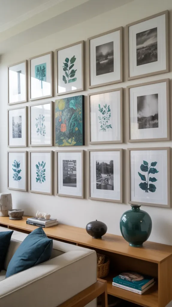
- Color story — Pieces that share a similar palette or accent color
- Subject matter — Landscapes, portraits, abstracts, or botanical themes
- Art style — Modern, vintage, minimalist, or eclectic
- Frame finish — Black, white, natural wood, or metallics
- Personal journey — Places you’ve traveled or milestones in your life
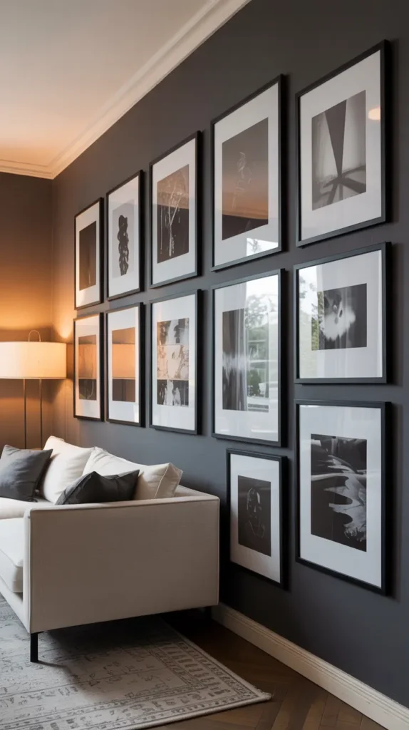
One of my favorite gallery walls I’ve ever helped create used black and white photography from a friend’s travels across three continents. The uniformity of the monochrome images created cohesion, while the diverse subjects (architecture, landscapes, portraits) kept it interesting. We added just two color photos that featured vibrant red elements, which created perfect little pops of interest.
Hot tip: If you’re struggling to find a theme, look at your existing decor for inspiration. What colors already feature prominently in your space? What style best describes your furniture? Your gallery wall should feel like a natural extension of your existing aesthetic.
Mix Sizes and Shapes (But Keep Some Consistency)
One of the easiest ways to make a gallery wall look amateur is to use all the same size and shape of frames. Conversely, one of the quickest routes to a professional-looking display is to thoughtfully mix various dimensions.
For a dynamic gallery wall, consider including:
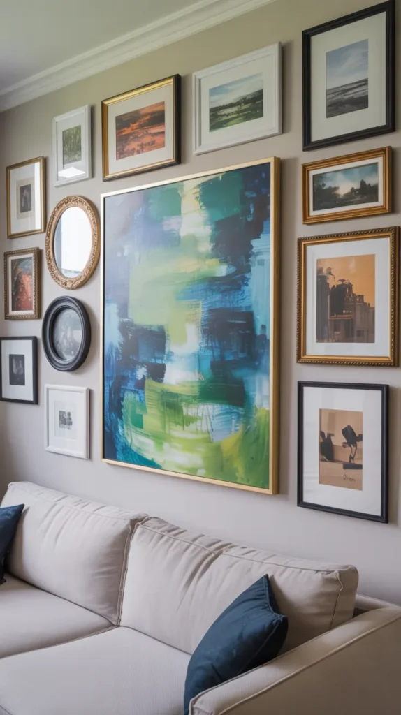
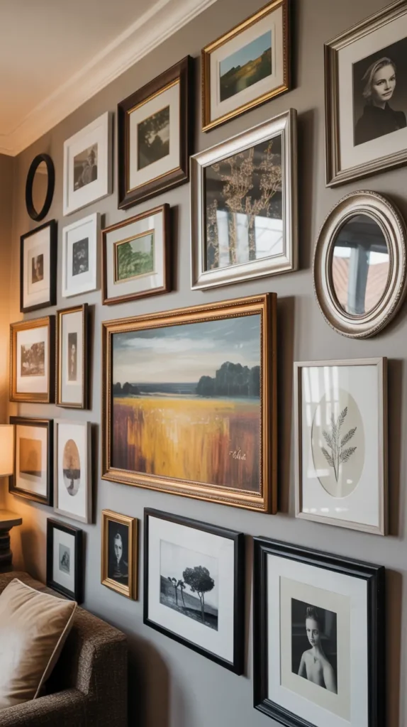
- At least one or two larger anchor pieces
- Several medium-sized works
- A few smaller pieces to fill gaps and create interest
- A mix of orientations (portrait and landscape)
- Perhaps one or two unusually shaped pieces (round, oval, or custom)
What keeps this mix from looking chaotic is the thoughtful arrangement and spacing. I usually recommend keeping the space between frames consistent (typically 2-3 inches) to create a sense of intention and order amidst the variety.
I recently helped a friend revamp her living room gallery wall, and the transformation was dramatic. We replaced her grid of same-size frames with a more dynamic arrangement featuring pieces of varying dimensions. The difference was striking—what was once flat and forgettable became the most commented-on feature in her home.
Plan Your Layout (Trust Me on This One)
I cannot stress this enough: plan your layout BEFORE you put any holes in your wall. This step separates the gallery wall winners from those who end up with a dozen unnecessary nail holes and a headache.
My favorite planning methods include:
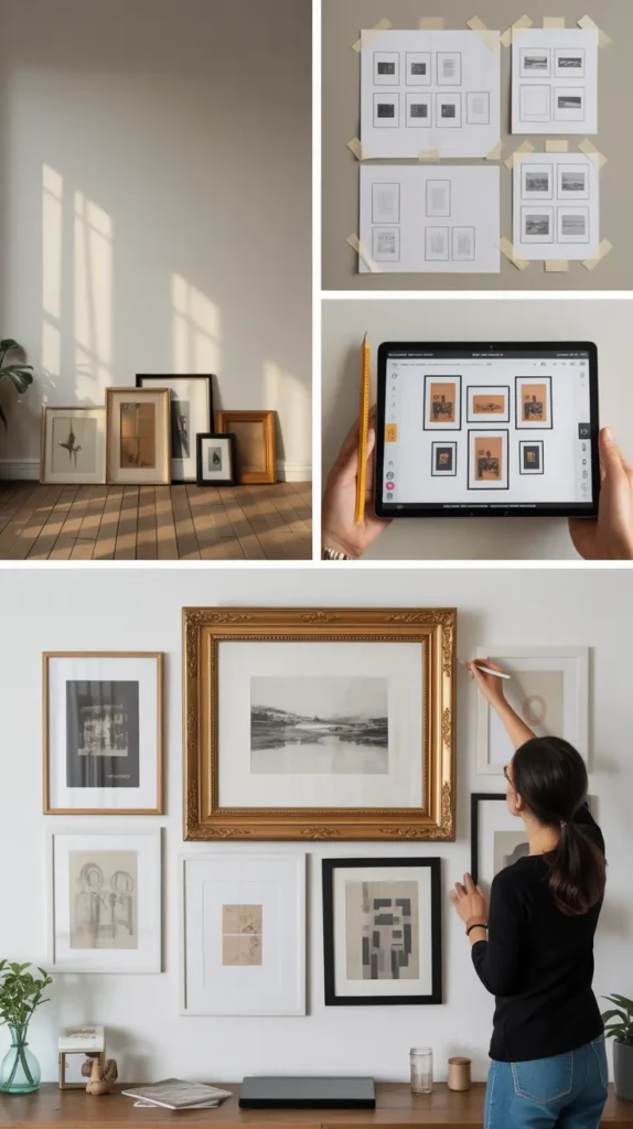
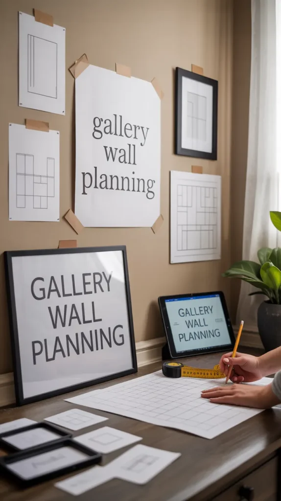
- The floor layout — Arrange everything on the floor beneath your target wall first
- The paper template — Trace each frame onto kraft paper, cut out the shapes, and tape them to the wall to experiment with arrangement
- The digital mockup — Take photos of your art and use an app to create a virtual arrangement
- The measuring method — Carefully measure your wall and each piece, then draw a scaled diagram
When planning your layout, start with your largest piece or pieces. These anchor works should be placed slightly off-center, usually at eye level or just below. From there, build outward with your medium and smaller works, maintaining balanced visual weight across the arrangement.
I’ve learned (the hard way) that spending an extra 30 minutes planning can save hours of frustration later. Plus, seeing the pieces together before they’re on the wall gives you the chance to make adjustments if certain works don’t play well together.
Choose Your Frames Wisely (They’re More Important Than You Think)
Frames aren’t just functional—they’re a major design element that can make or break your gallery wall. The right frames unite diverse pieces into a cohesive collection, while the wrong ones can make even beautiful art look disjointed.
When selecting frames, consider these approaches:
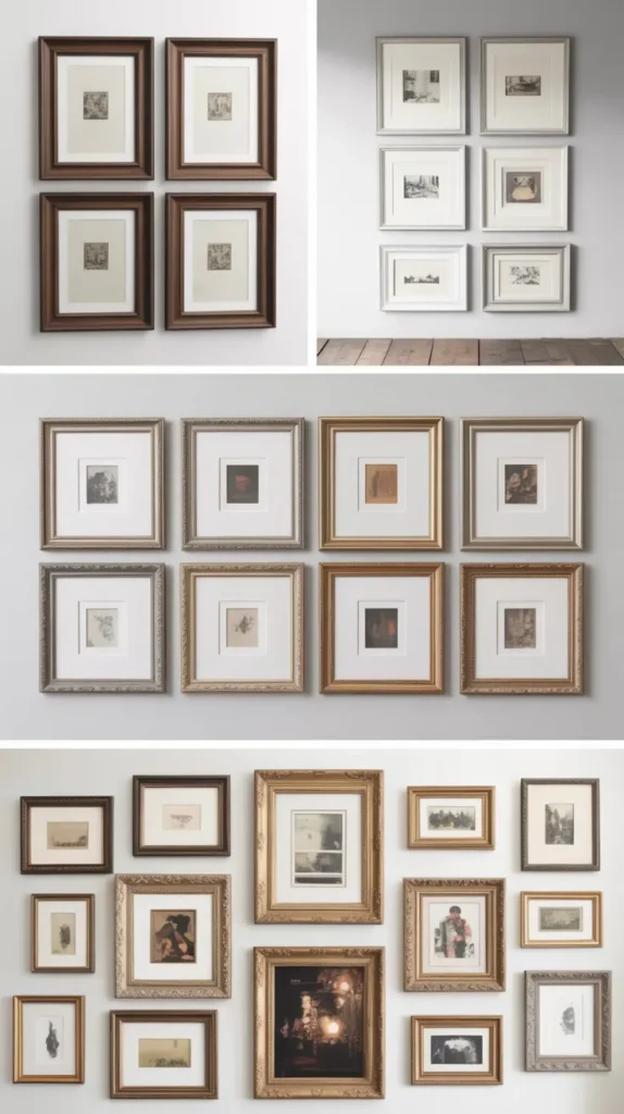
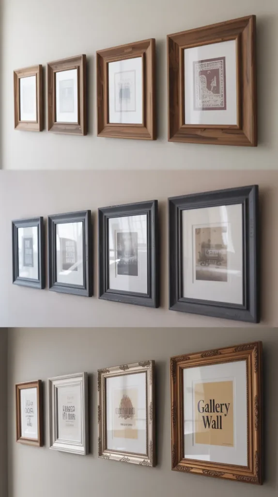
- Completely matching — Same style and finish for a clean, formal look
- Color cohesion — Different styles but the same color (all black, all white, all natural wood)
- Material cohesion — Same material but different profiles or finishes
- Deliberate eclectic — Varied styles that share some unifying element
For most living rooms, I recommend the “color cohesion” approach. Using frames in the same color family but with some variation in width, profile, and texture creates a balanced look that’s neither too rigid nor too chaotic.
A gallery wall I created for my own living room features black frames in various widths and profiles—some modern and slim, others more substantial with texture. The consistent color creates unity, while the variations add interest and allow each piece to maintain its individual character.
Create Visual Flow (Make Their Eyes Dance)
A truly great gallery wall guides the viewer’s gaze in a deliberate journey across the composition. This visual flow transforms a collection of individual pieces into a cohesive whole that’s greater than the sum of its parts.
To create compelling visual flow:
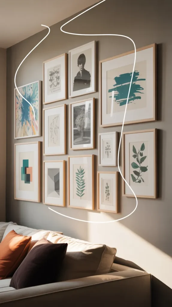
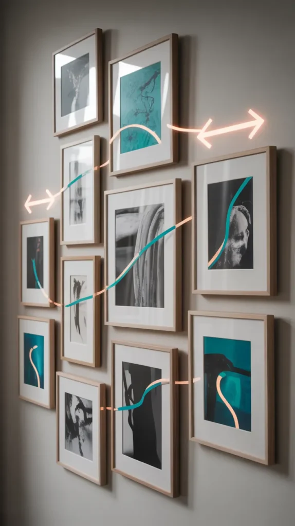
- Position pieces so that they form natural pathways for the eye to follow
- Use alignment points where elements line up (top, bottom, or center)
- Consider how colors, shapes, or subjects in one piece might lead to another
- Create mini-clusters within the larger arrangement that form visual “resting points”
- Leave enough negative space to let the composition breathe
I find it helpful to stand back and literally trace the path my eyes take when looking at the arrangement. If my gaze jumps around randomly or gets stuck in one area, that’s a signal that the flow needs adjustment.
One particularly successful gallery wall I helped design used a subtle “S” shape arrangement that led viewers on a natural journey from a large landscape at the top left, through a series of smaller works, ending with another substantial piece at the bottom right. Visitors regularly commented on how drawn they were to explore each piece.
Balance Without Boring Symmetry (Unless That’s Your Thing)
Perfect symmetry works for some spaces (particularly formal ones), but most living rooms benefit from a balanced arrangement that isn’t rigidly symmetrical. This approach feels more collected and natural while still providing the visual harmony our brains crave.
To achieve balanced asymmetry:
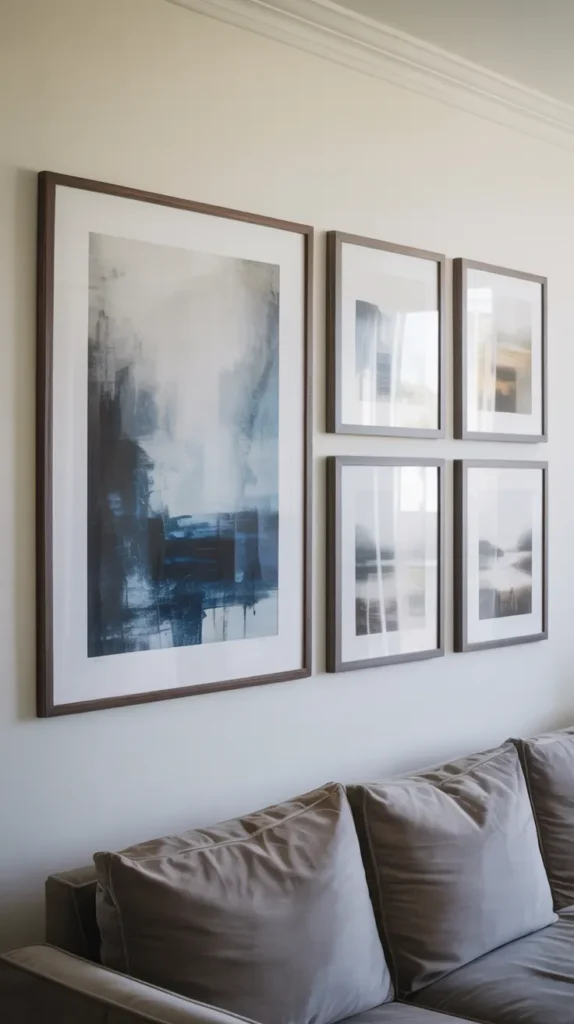
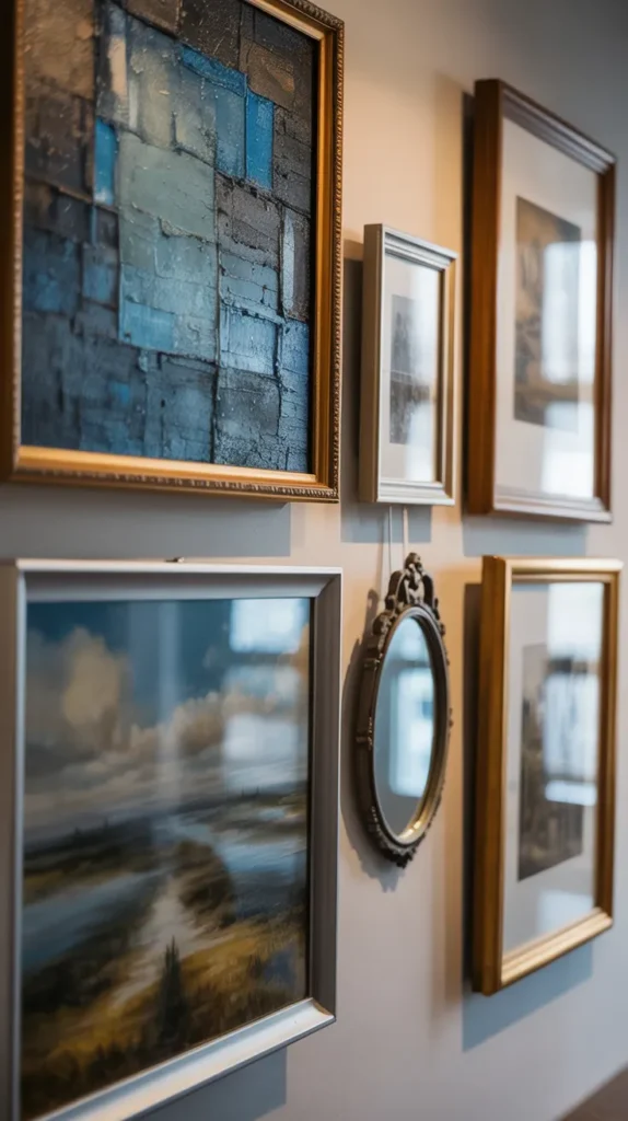
- Distribute visual weight evenly across the wall
- If you have a heavy piece on one side, balance it with multiple lighter pieces on the opposite side
- Consider the “weight” of colors as well as sizes (darker colors and busy patterns feel heavier)
- Maintain similar density throughout the arrangement
- Step back frequently to assess the overall balance
One trick I often use is to photograph the tentative arrangement and then look at the photo rather than the wall itself. This slight distancing often makes imbalances immediately apparent in a way that’s harder to see when you’re up close and focusing on individual pieces.
My favorite gallery walls have a sense of thoughtful imperfection—they feel collected over time rather than purchased as a matching set. This organic quality makes a space feel lived-in and personal in a way that perfect symmetry rarely achieves.
What to Include Beyond Traditional Artwork (Get Creative!)
Who says gallery walls must be limited to framed prints and photos? Some of the most interesting collections incorporate unexpected elements that add dimension, texture, and personality.
Consider incorporating:
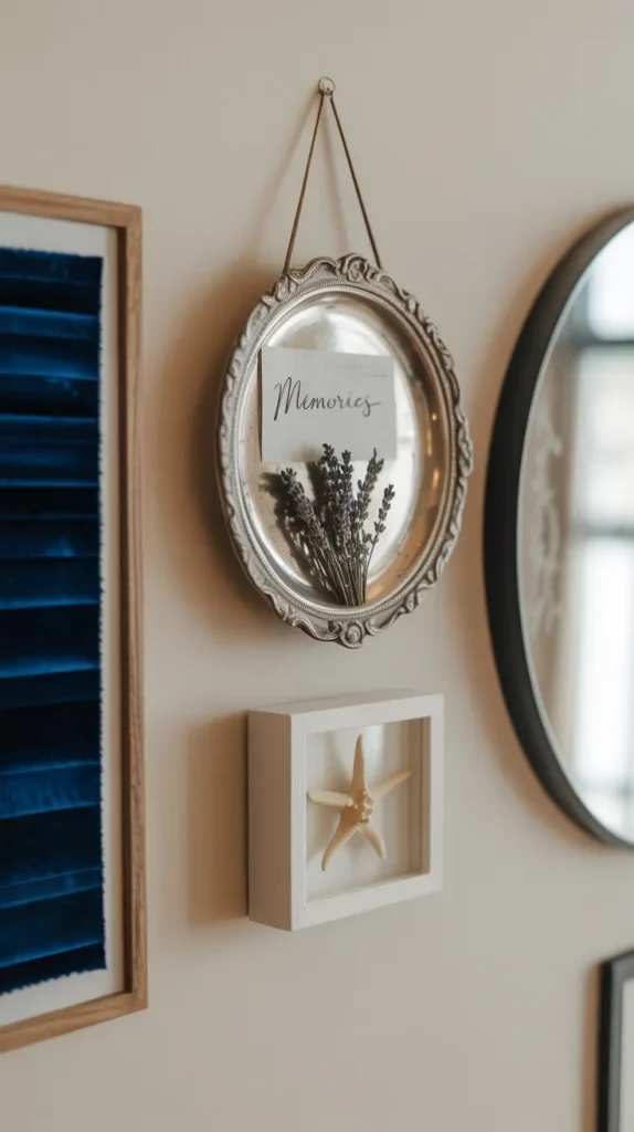
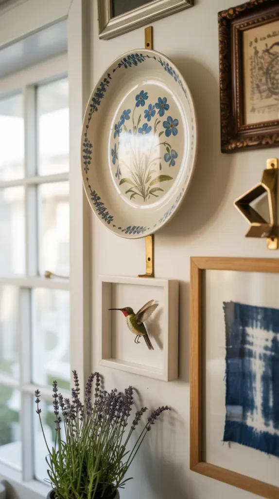
- Dimensional objects — Masks, small sculptures, or shadowboxes
- Textiles — Framed fabric swatches, small weavings, or embroidery hoops
- Mirrors — Small decorative mirrors that reflect light and add sparkle
- Plates or platters — Especially those with interesting patterns or textures
- Letters or words — Vintage signage, wooden initials, or meaningful quotes
- Natural elements — Pressed plants, butterfly specimens, or geological samples
I recently helped a friend create a gallery wall that included a small antique mirror, her grandmother’s embroidered handkerchief (framed), and a sculptural wooden mask from her travels alongside more traditional framed photographs. The mix of dimensions and textures made the wall endlessly interesting and deeply personal.
Starting Your Own Gallery Wall: Where to Begin
If you’re feeling inspired but a bit overwhelmed, here’s my simple step-by-step approach to getting started:
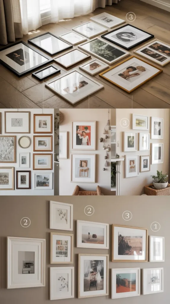
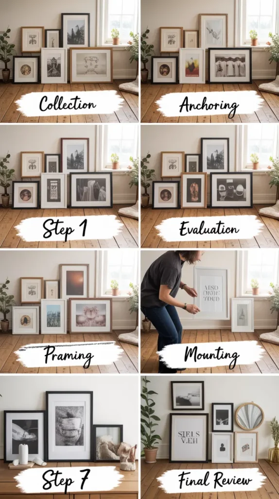
- Collect potential pieces — Gather artwork and objects you love (more than you’ll need)
- Identify your anchor piece(s) — Select one or two larger works that will form the heart of your display
- Edit for cohesion — Look for connections in color, theme, or style among your collection
- Choose your frames — Select a framing approach that complements both your art and your space
- Plan your layout — Arrange everything on the floor or create templates before hanging
- Start hanging — Begin with your anchor pieces and work outward
- Adjust as needed — Step back frequently, be willing to make changes, and don’t rush the process
Remember that a truly personal gallery wall often evolves over time. You don’t need to complete the entire project in one weekend. Start with a core arrangement and allow yourself to add pieces as you find ones that speak to you.
Final Thoughts: Your Wall, Your Rules
While I’ve shared a lot of guidelines here, the most important thing to remember is that your gallery wall should make YOU happy every time you look at it. If that means breaking some “rules” along the way, so be it!
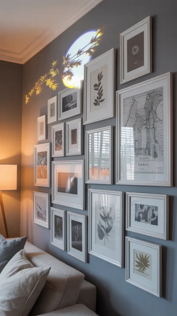
Some of the most striking gallery walls I’ve seen intentionally break conventions—like one that was entirely composed of different sized frames painted the exact same color as the wall, creating a subtle monochromatic texture that was absolutely stunning.
Your living room gallery wall is ultimately an expression of your personal aesthetic and story. Whether you prefer a precise grid of matching frames or an organic collection of diverse pieces, the most successful gallery wall is one that feels authentically you.
So gather those pieces you love, roll up your sleeves, and transform that blank wall into something that makes your heart happy every time you enter the room. I promise it’s worth the effort! ✨

